Saltoo
STatus
Graphic Designer
Client
Saltoo / The House of Support
Visual identity for Saltoo, a consultancy service helping you spring your sales to the next level with a tailored approach to the specific needs of your people and company.
Read more
CHALLENGE
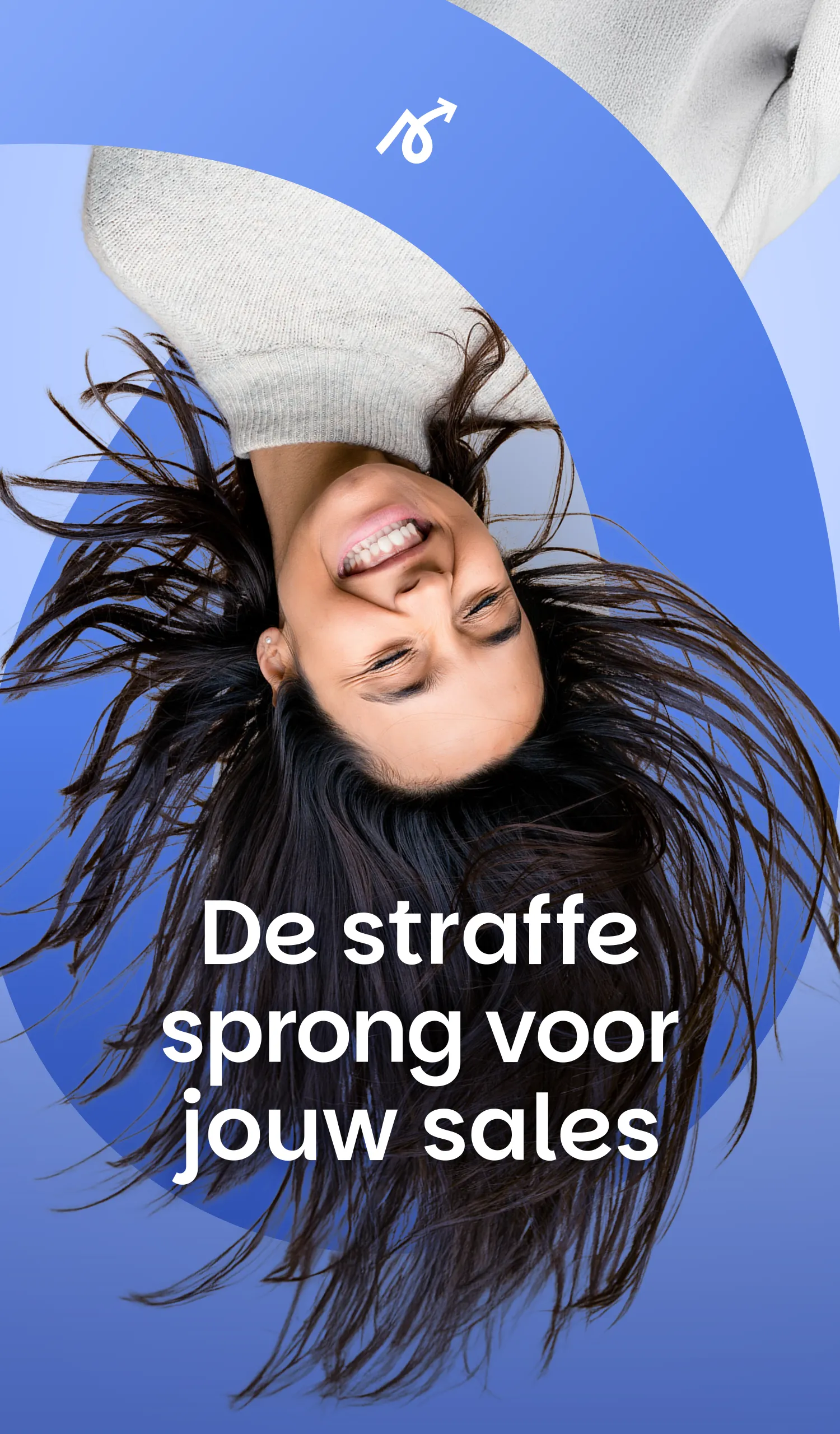
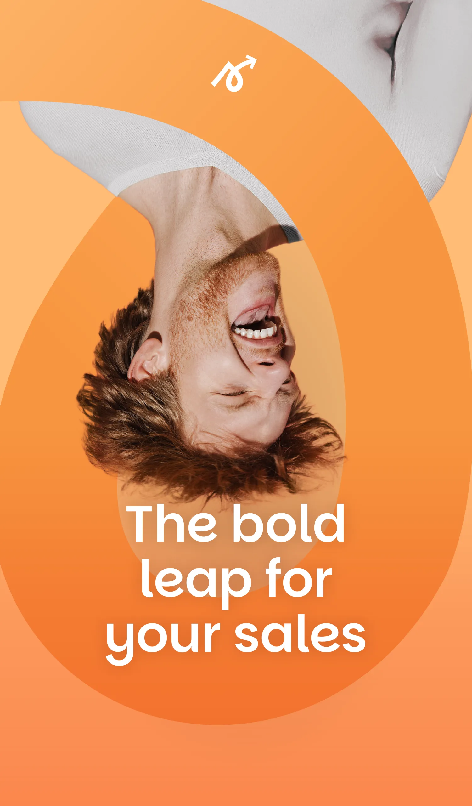
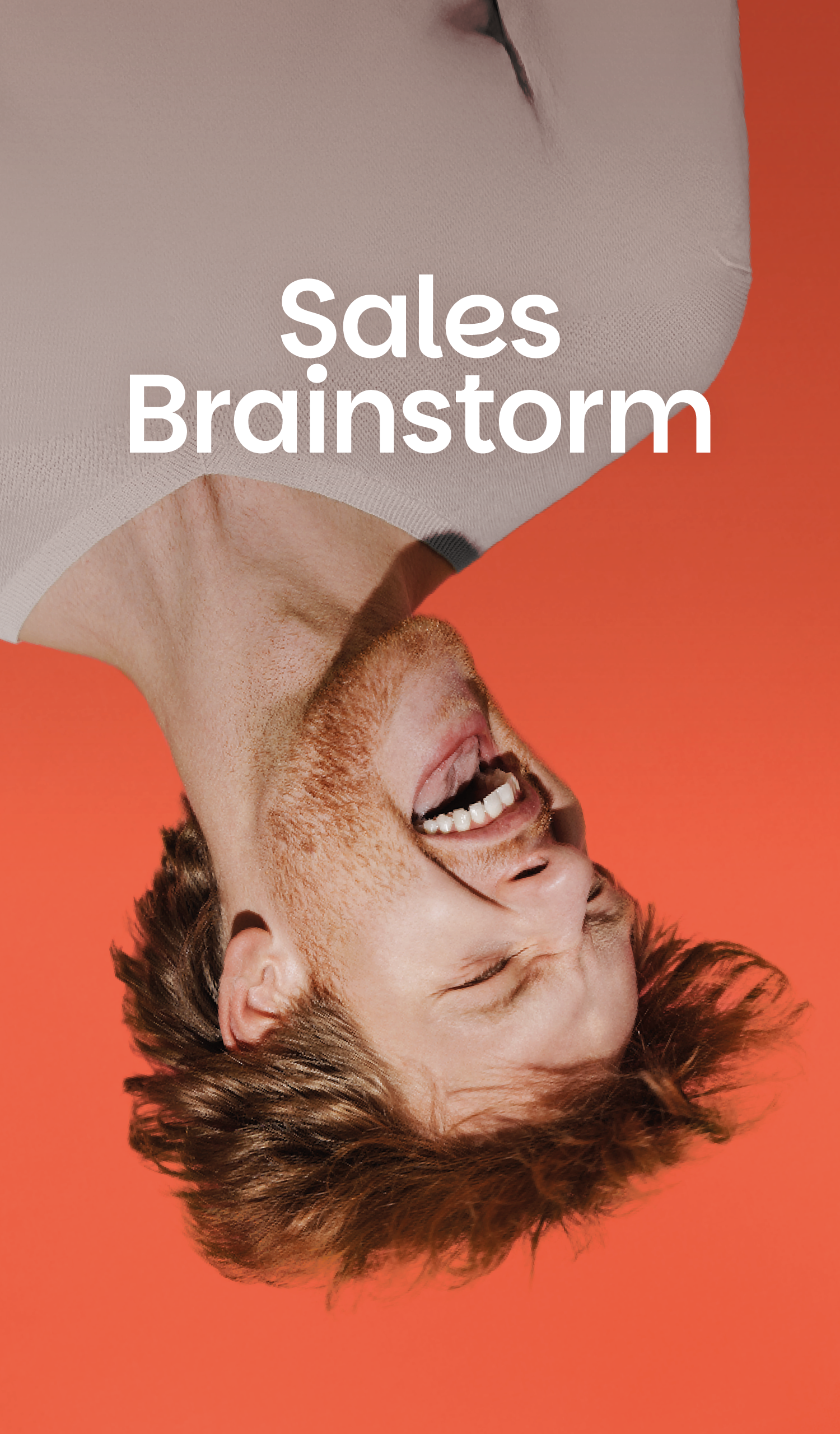
Saltoo is a new service launched by The House of Support. The name summarizes their services (sales, training, optimisation, outsourcing) and a base concept: salto as a jump, a leap, as their baseline states “The bold leap for your sales”. While the identity had to fit the corporate vibe of the mother and sister brands, this one had to be more playful and human.
PROPOSITION
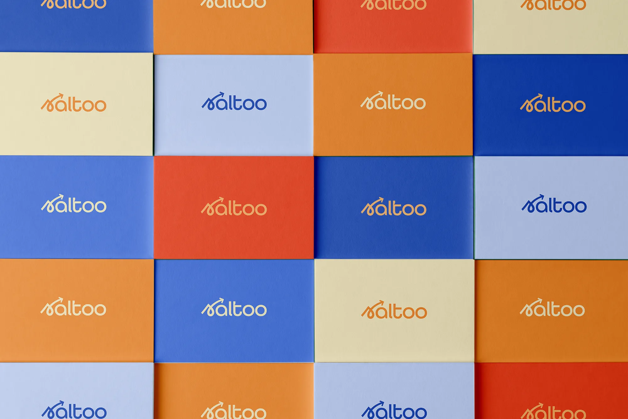
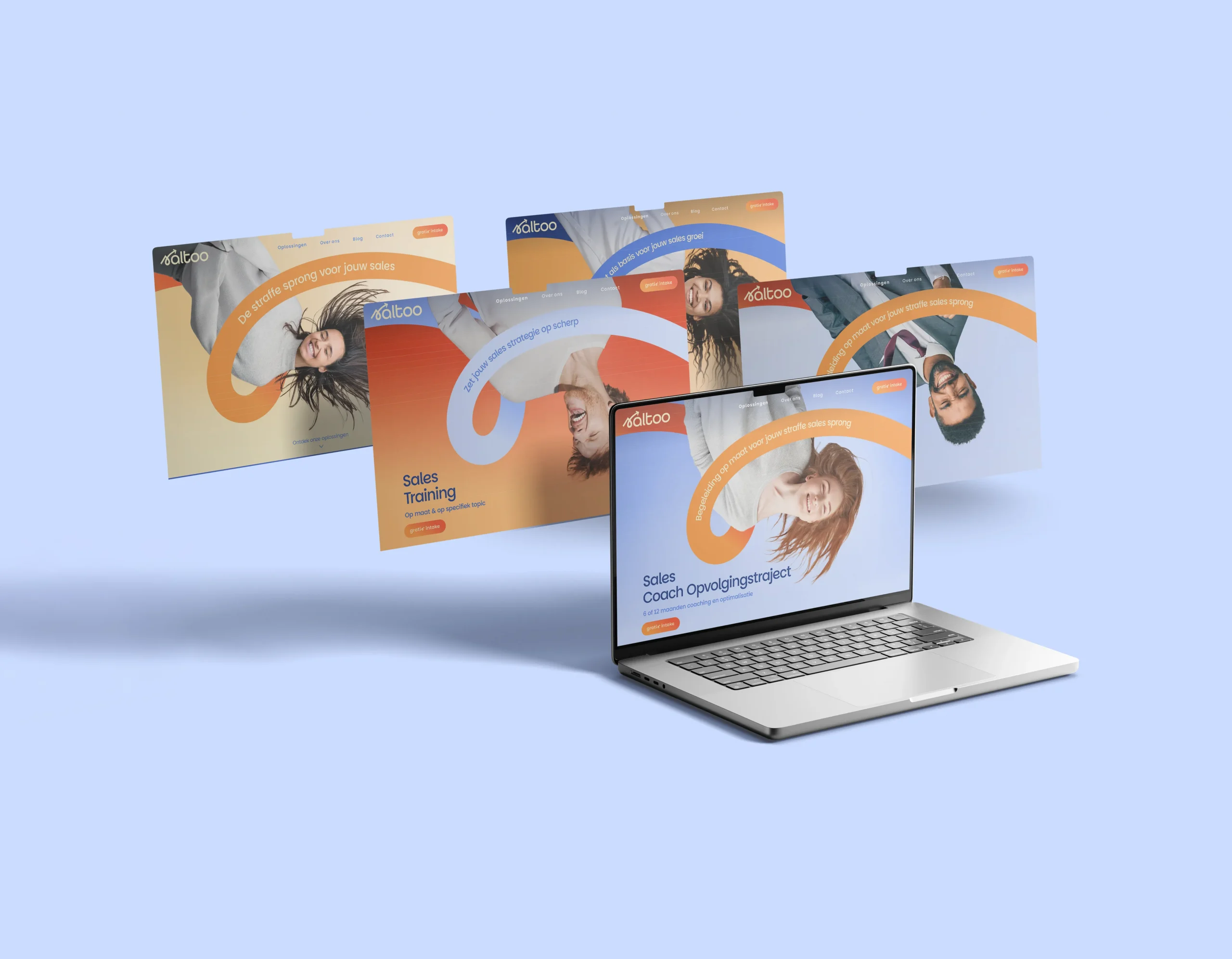
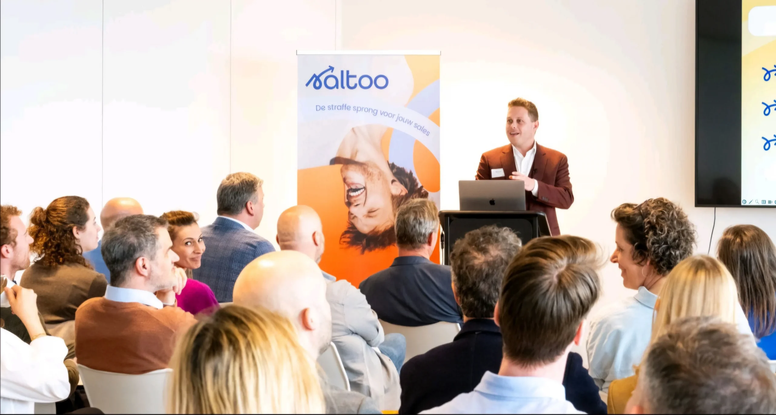
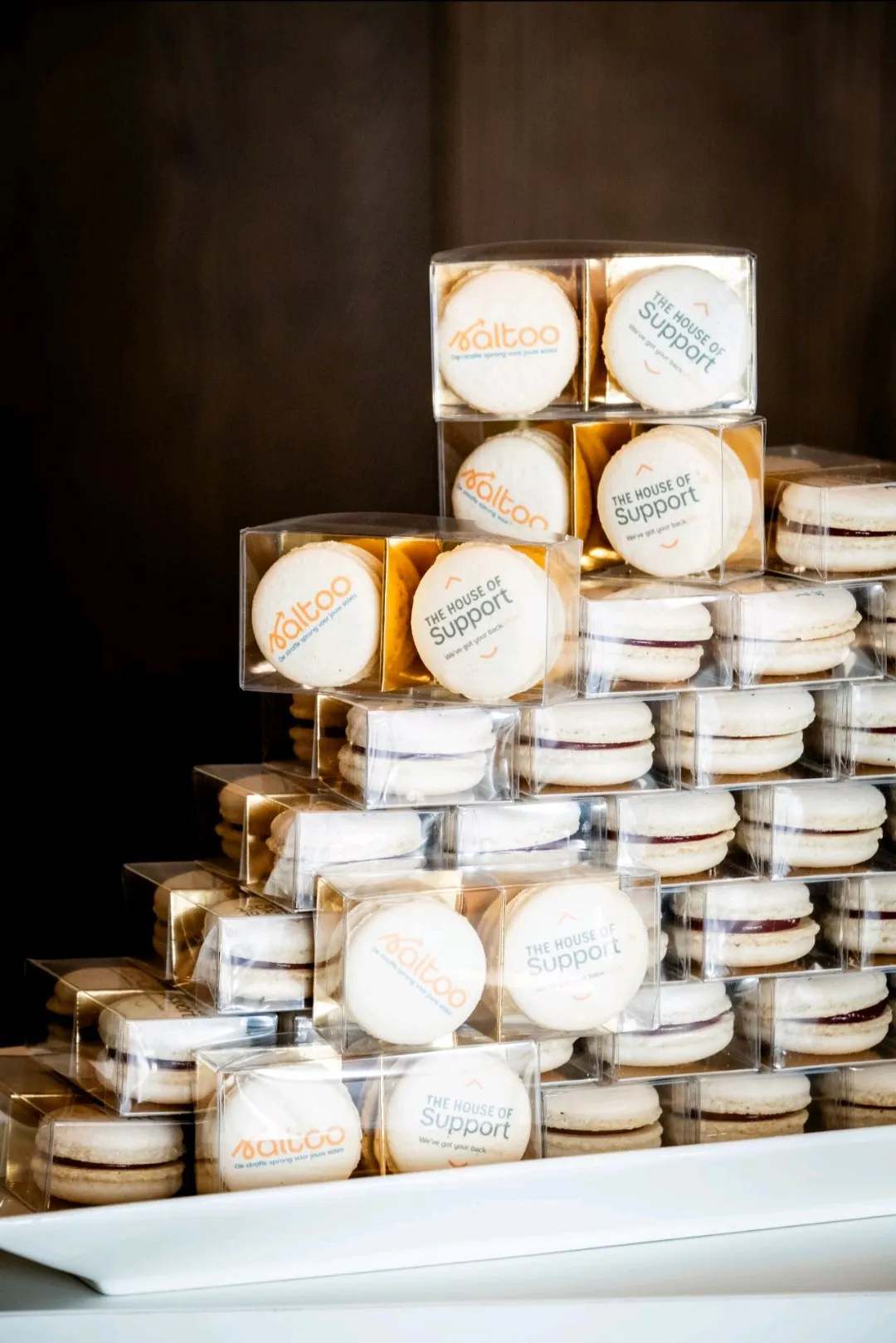
The logo as a sans serif wordmark keeps the corporate vibe, while the rounded letters and a handwritten inspired first letter bring a playful touch. The S becomes the logo mark and its loop becomes a recognisable graphic element used throughout visual communication for dynamism and playfulness. Through photography, the focus is centered on the human experience: rather than literally showing someone backflipping, we are showing the effect on people’s faces, a rollercoaster to jumpstart sales. The colour palette consists of multiple tints of a soft lilac and punchy orange to mix and match.